Project Overview & Context
The Brand:
Rebel Agency, a creative team of "marketing peeps, web designers, and developers" who know how customers think.
The Spirit:
Fun. Bold. Creative. & "we know our shi-stuff."
The Hook:
"We're bananas about digital."
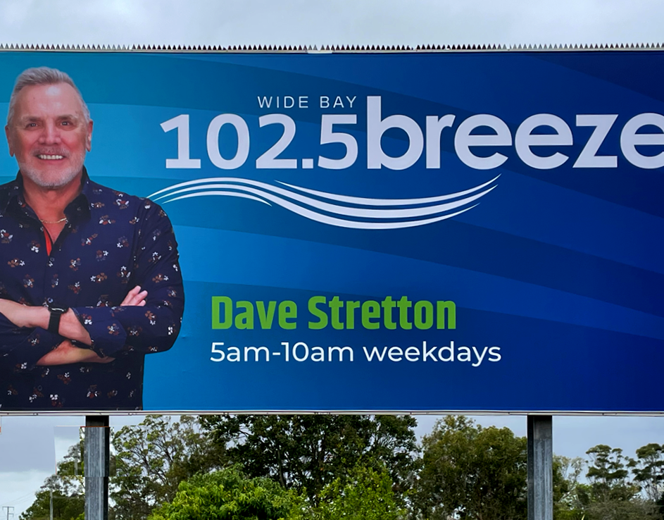
The Business:
Rebel Agency is the digital agency sister company to the long standing radio stations Rebel FM and The Breeze. They are a Gold Coast-based creative team of marketing specialists, designers, and developers.
The Culture:
Built on integrity, trust, and a "fun, bold, creative" spirit.

The Challenge: Retiring the Ninja
The Problem:
The previous "Rebel Digital" identity—centred on a cartoon ninja and a restrictive pink/black palette—no longer reflected the agency's offerings - SEO, web, and creative services - and aspirations. The company wanted to stand more on its own feet instead of relying on the legacy of its Radio Station sisters.
The Goal:
To create a brand that was "fun and a bit cheeky" while maintaining enough professional weight to pitch to large B2B/B2C clients and retailers.

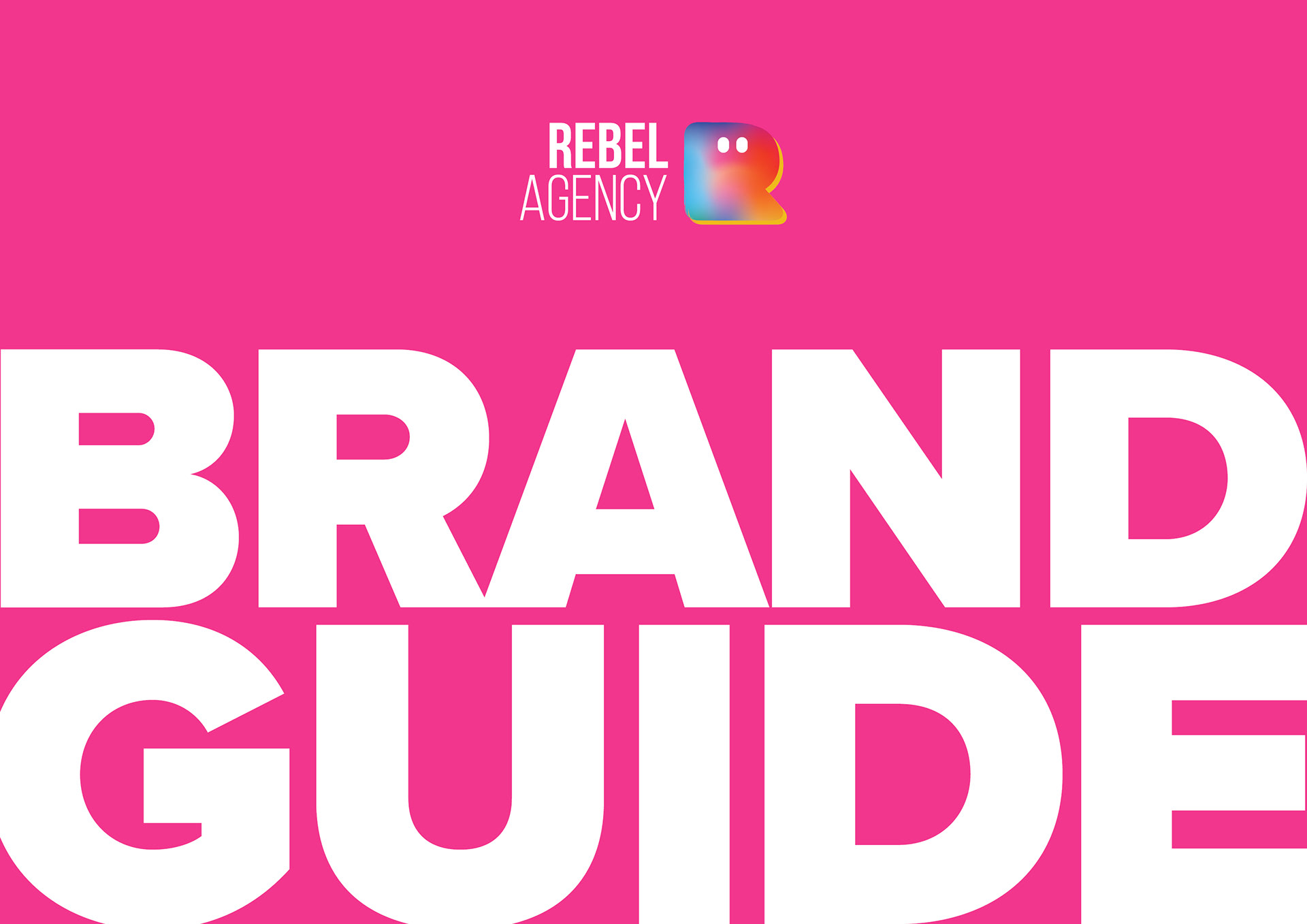
The Solution: A Bold Brand System
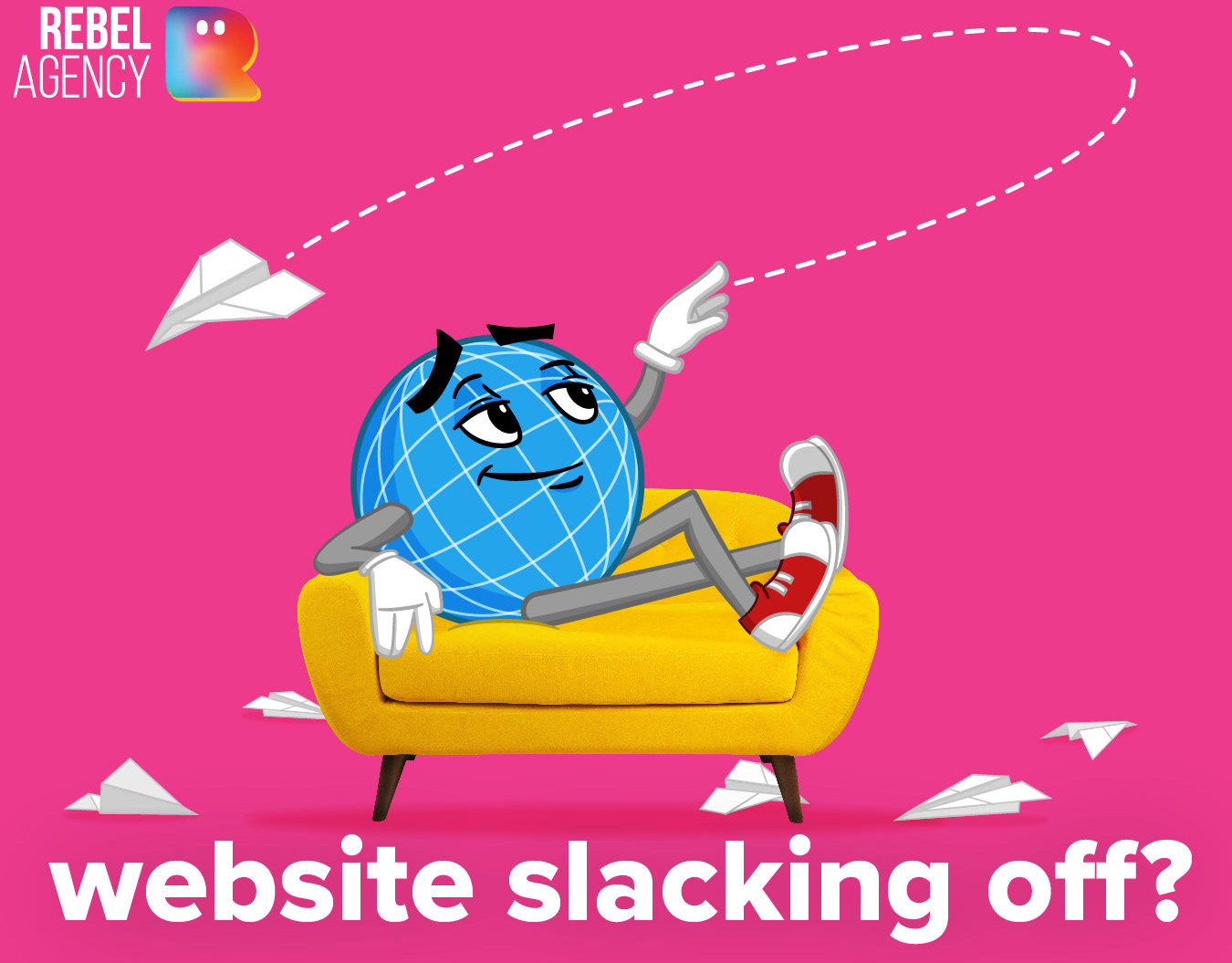
The "Monster" Asset:
Moving beyond a static logo to an expressive brand mascot that can frame video content, showcase client work, or adapt for festive seasons. It showcases the brand's versatility while also being fun and creative.
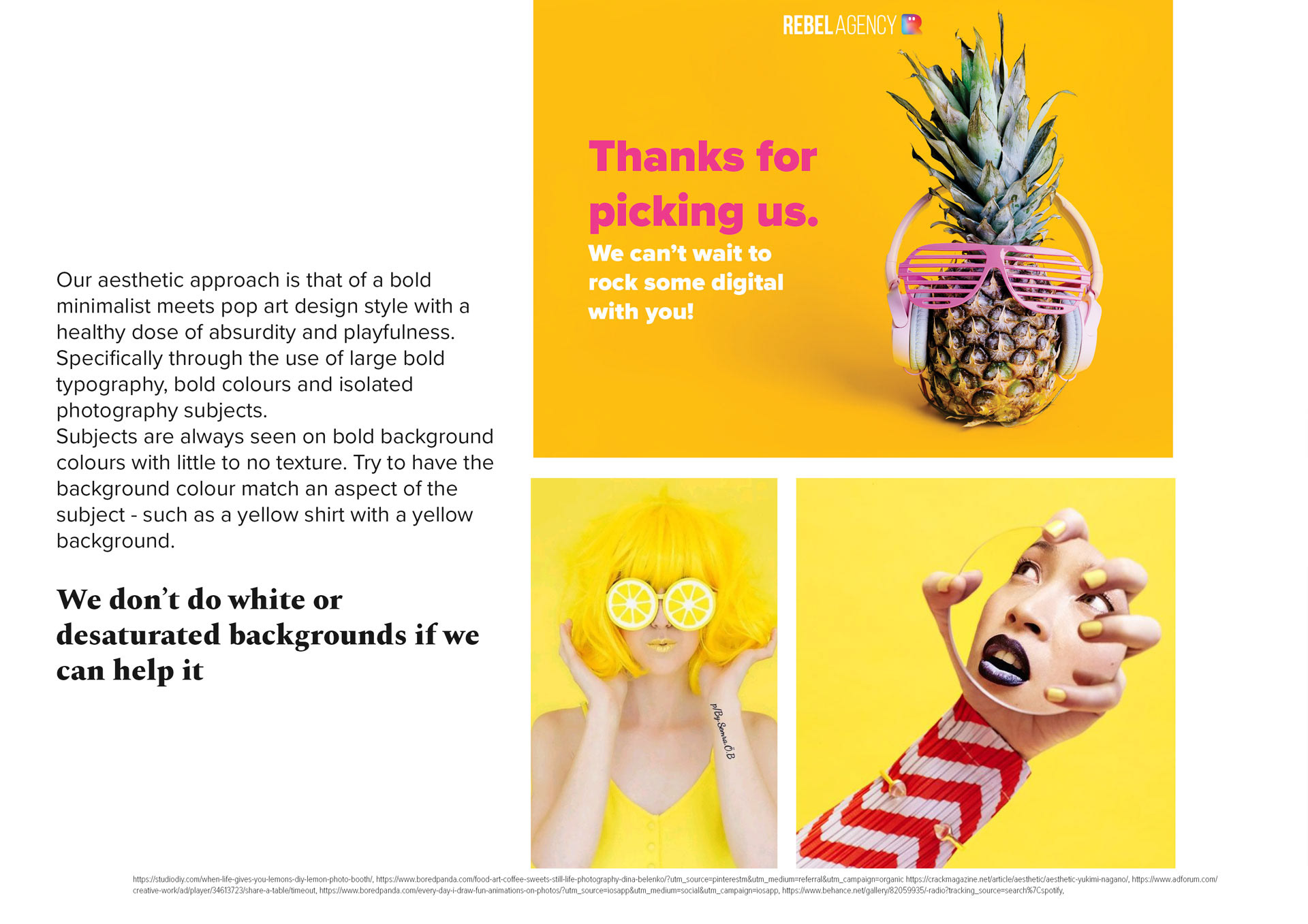
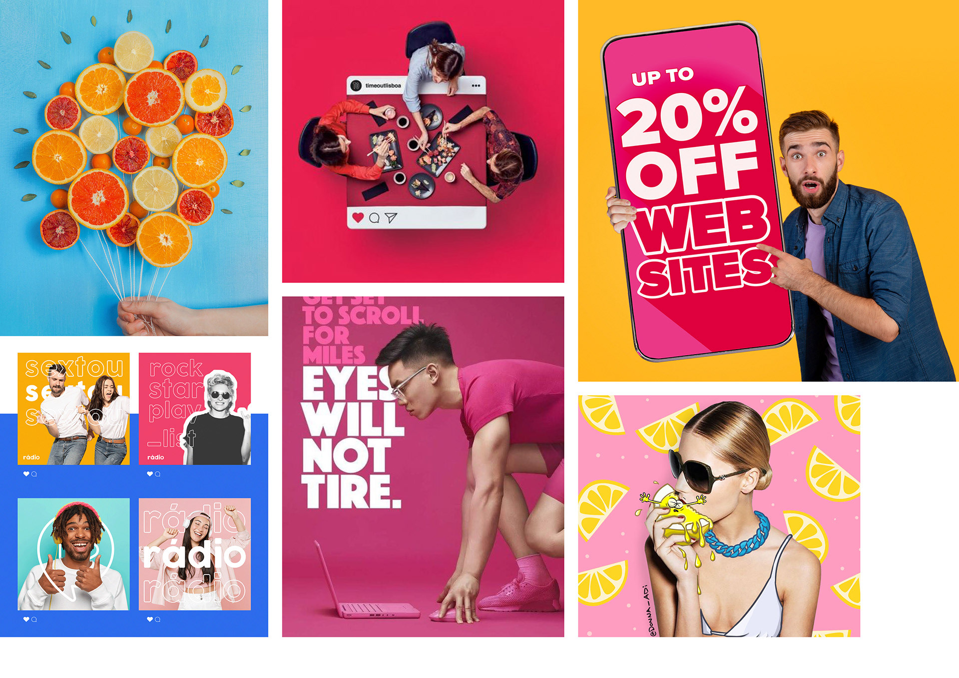
Visual Language:
A "bold contemporary pop art" style using large typography, vibrant colours, and isolated subjects on solid backgrounds.
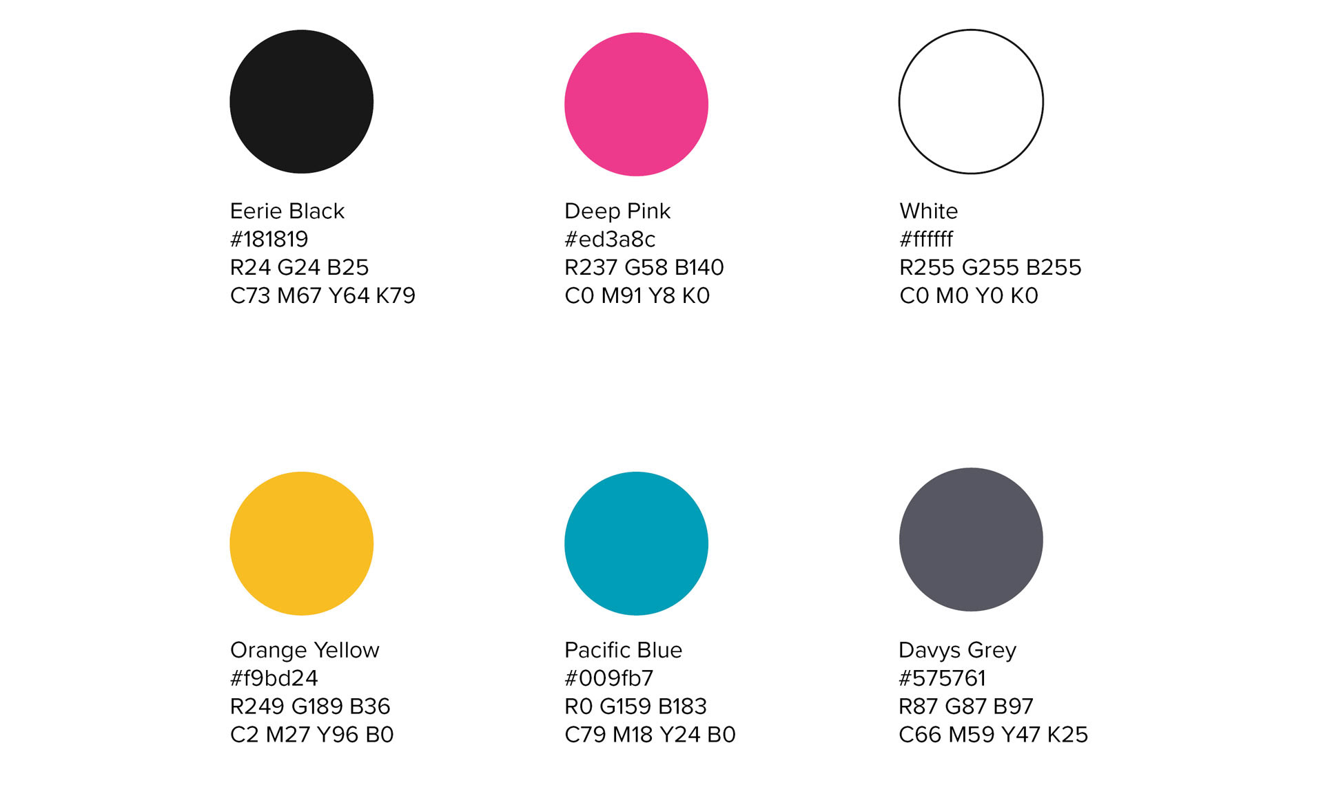
Colours:
The colours chosen are reminiscent of the classic CMYK (Cyan, Magenta, Yellow, Black) but are just a liiiiitle bit different. Just like the Agency, the colours harken to a technical proficiency but also represent creativity (Orange Yellow), passion (Pink) and trustworthiness (Pacific Blue). Together they are a fun rainbow of exciting colours.
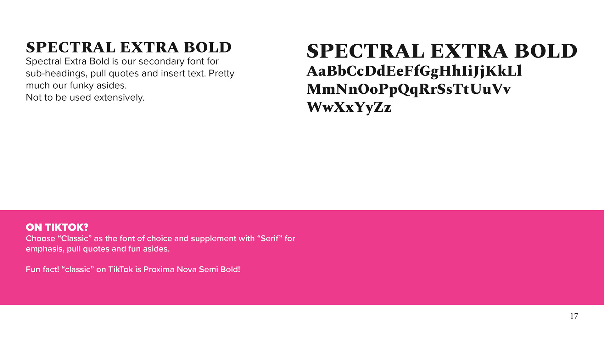
Typography:
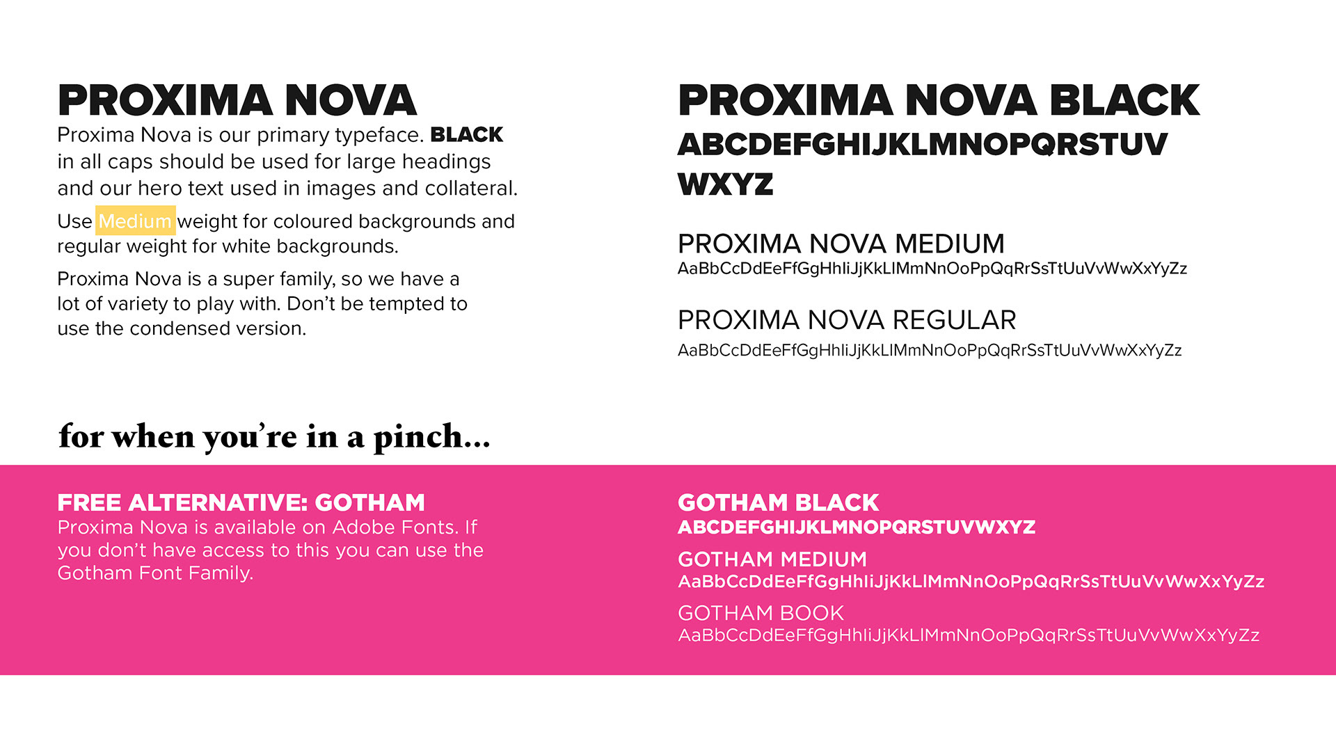
A robust hierarchy using Proxima Nova for authority and Spectral Extra Bold for "funky asides." Proxima Nova was chosen for its large family and for its friendly, legible face. Spectral was chosen for its modern high-to-medium contrast serif design, it's also a humanist typeface and thus friendly.
Many people in the company are not designers but are tasked with creating assets for social media on platforms that do not have these fonts; for these, the closest alternative is suggested.
Many people in the company are not designers but are tasked with creating assets for social media on platforms that do not have these fonts; for these, the closest alternative is suggested.
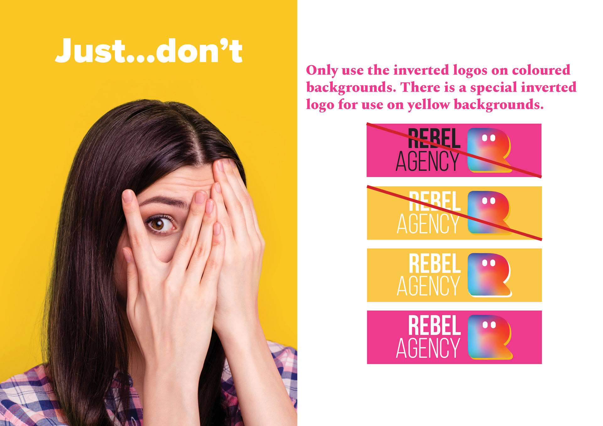
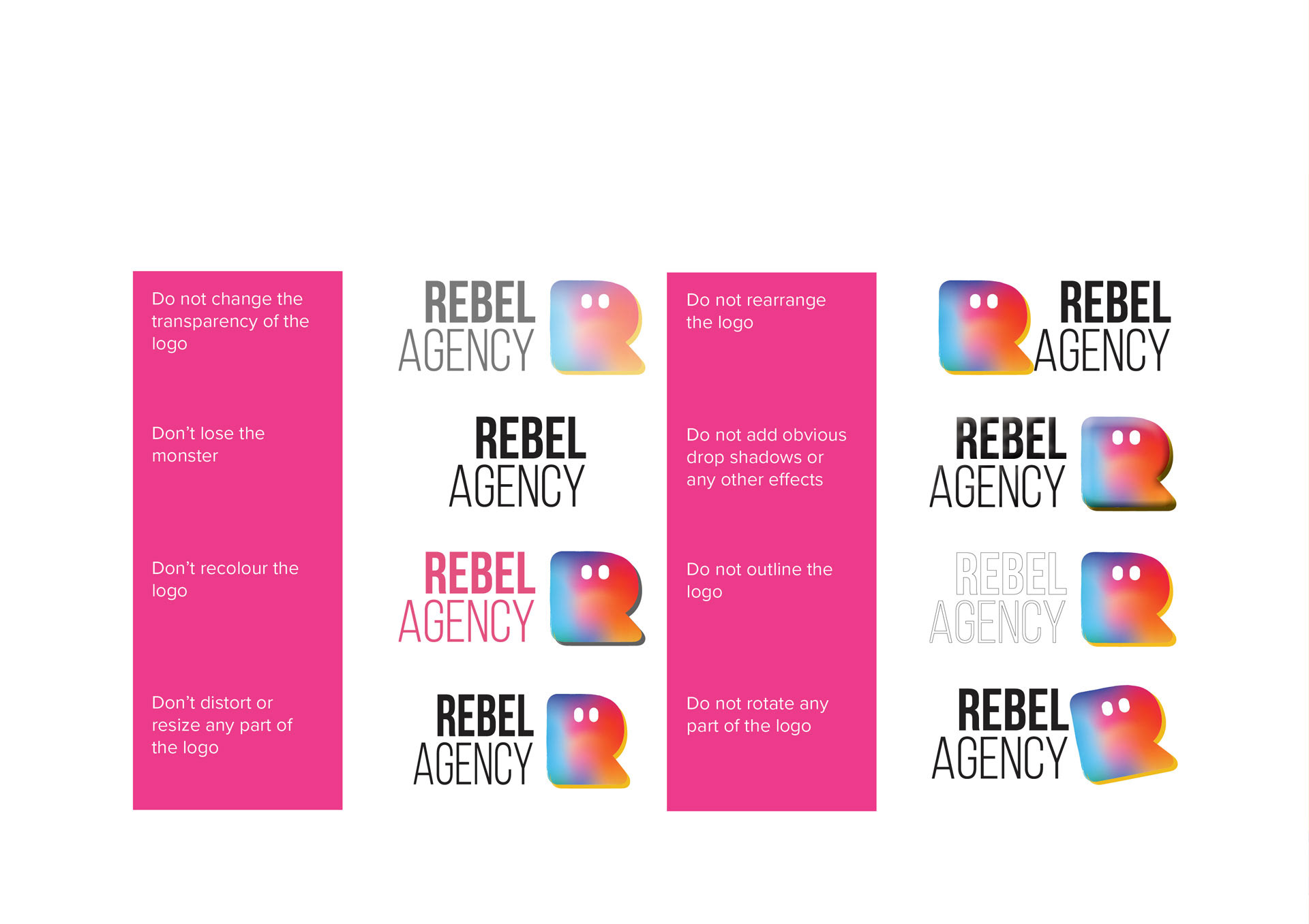
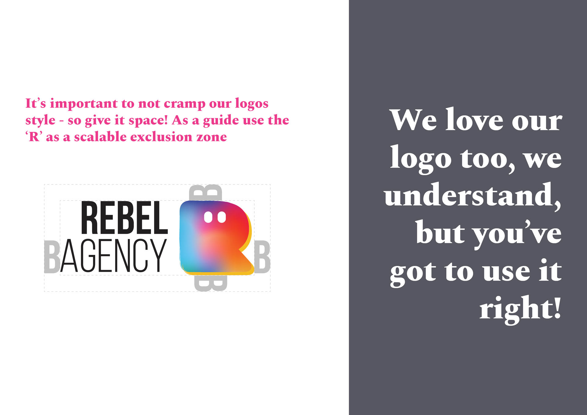
The Rules:
Establishing strict "Logo Misuse" and "Exclusion Zone" rules to ensure the brand remains unbreakable across all commercial touchpoints.

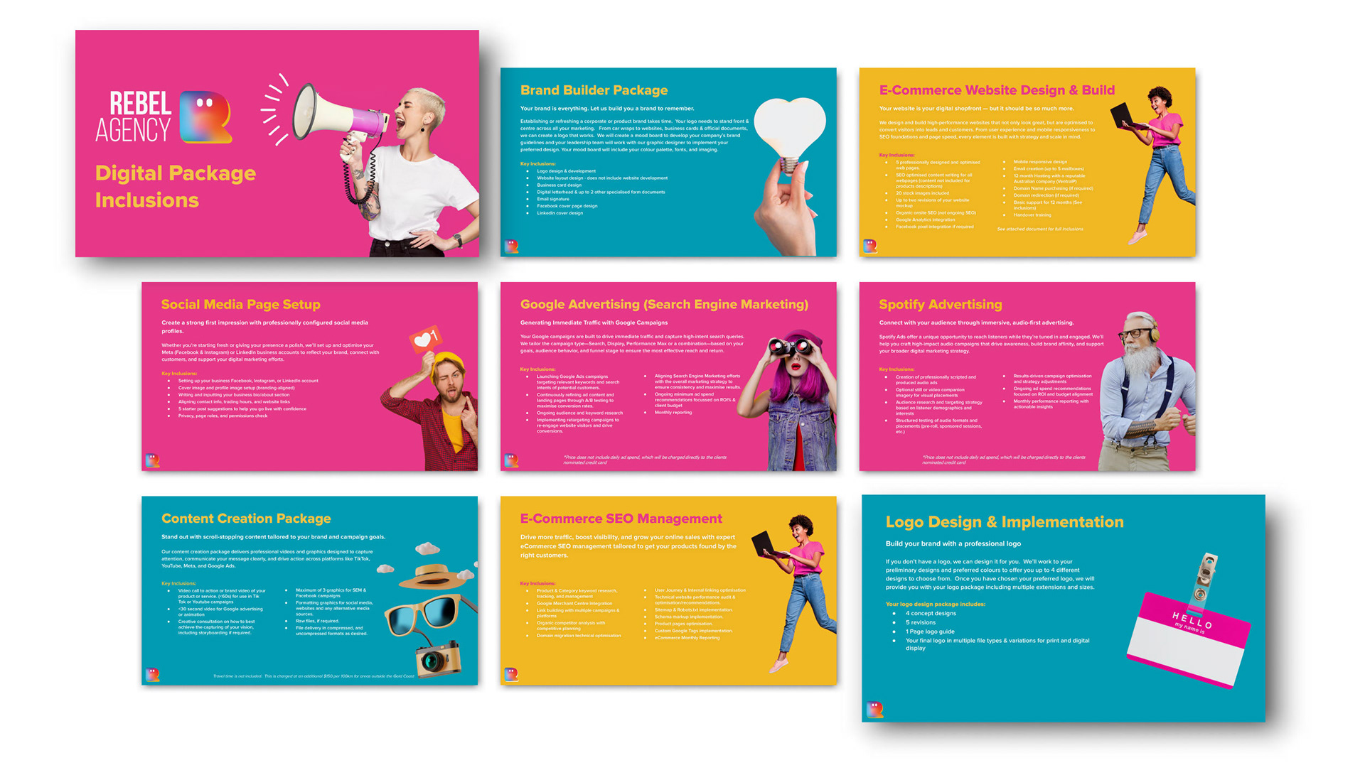
Sales Team B2B Toolkit
Google Slides Integration:
The team needed a way to pitch complex services, such as SEO, SEM, and Video, in a way that felt both accessible and premium.
I designed a modular proposal deck that allows the sales team to be agile and tailor each proposal to their potential client while staying "on-brand." Google Slides was chosen as it is the avenue available to the Sales Team.

Impact & Outcome
The Result:
A successful relaunch that unified the agency's diverse services (Web, SEO, Photo, Video) under one cohesive, high-energy identity.
Key Achievement:
Bridging the gap between a "rebellious" radio heritage and a professional agency service, leading to higher confidence in national-scale pitches.
Awarded:
Internal Outstanding Achievement award for the rebrand